 |
Home | Search | Browse | About IPO | Staff | Links |
|
Home | Search | Browse | About IPO | Staff | Links |
|
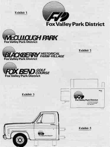
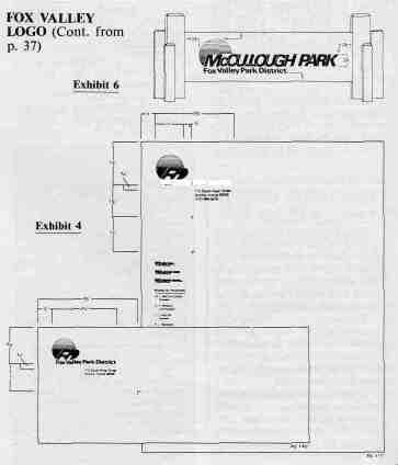
New Fox Valley Logo Gets The Job Done A good logo, like a good photo, is worth more than a thousand words. The Fox Valley Park District recently developed a new logo which is adaptable for many uses. It has worked out well, says director Chuck Hoscheit. By Virgil E. Tipton Jr., Editor, IPR "We are quite pleased with our new logo because it is modernistic and it can be adapted for many uses," says Chuck Hoscheit, director of Parks & Recreation at the Fox Valley Park District. The logo won first place in the IPRA Agency Showcase last fall in the category of best logo series. The Agency Showcase was a part of the many events at the annual Illinois Parks and Recreation Conference held at the Hyatt Regency O'Hare. Hoscheit said the logo series were designed by Crest Communications, Inc. of Oak Brook. "We had our own ideas about a logo before we contacted Crest," Hoscheit commented. "Those ideas were conveyed to the firm, they interviewed some of our employees and then they developed the logo in line with our suggestions." Next to the Chicago Park District, the Fox Valley Park District is one of the largest districts in the state. It has 90 parks to oversee. Hoscheit said the logo has been used for several purposes other than those pictured here. "We use it with our brochures, on the outside of our showmobile, on our annual reports, and, of course, our stationery which is updated when new board members are elected." The logo conveys the image of a sun rising and setting over a river. It consists of three colors: an orange colored sun, blue intitials FVD, and black lower line. Fox Valley Park District (see exhibit 1). According to Crest Communications, the logo "through its progressive, contemporary appearance, will effectively communicate the character of the Fox Valley Park District as a growing, aggressive service organization." The symbol in exhibit 1 is the basic design. Exhibit 2 shows the variety of uses that can be made of the basic design to create identities for other entities of the Park District. Exhibit 3 shows the business card which is the standard size of 2" X 3 1/2". Specifications call for white card paper stock, 8 point Helvetica Med. type for the address, 9 point Helvetica bold type for the name and 7 point Helvetica for the title under the name. The logo is three color. All other type is black. Exhibit 4 depicts letterhead and envelope. Crest suggests 20 lb. rag bond white paper with water mark for the letterhead. Exhibit 5 shows how the logo would appear on a park district vehicle. The basic color of vehicles should be green, and decals are suggested utilizing the full color logo on a white field. Exhibit 6 shows an example of exterior yard signage to identify each park. Wood panels are to be shaped and positioned in such a way as to give the proper field for the reproduction of the logo. So far, 70 of the Park District's 90 parks have been identified with the new logo. (Continued on p. 46)
Illinois Parks and Recreation 37 May/June 1984
Illinois Parks and Recreation 46 May/June 1984 |
|
|