|
It is the most dreaded time of year, the time the seasonal brochure is due. Procrastination kicks in, and it becomes even more of a thorn in our side. Eventually, whether we send it to a designer or we piece it together ourselves, we all finally produce a printed and bound seasonal brochure.
Why do we do this? With the emerging technologies available, isn't the traditional printed brochure a waste of time? Why not simply place our programs on the agency's Web site and be done with the whole business? After all, it would save the district money.
The seasonal brochure ... seems an old relic.
Or is it?
|
a relic or a phoenix rising?
|
July/August 2006 pages 20 and 21
|
Can we ever move away from the seasonal brochure? Is it truly a waste of our time and money? Or is the seasonal brochure like the Phoenix regenerating itself and experiencing immortality in the world of parks and recreation? Just when you think it is dead and gone, it re-emerges more powerful than ever.
How and why does this happen? The simple answer is because, at this time, people still want a paper copy of the seasonal brochure. Think of Talbots or J.C. Penny or many other upscale retail operations. With all their sophisticated research, their high-end Web sites and their marketing budgets with more zeros than any park and recreation agency will ever see, these private-sector companies still produce and mail paper catalogues, because that's what today's customers and clients still want.
So the challenge remains. How do marketing professionals at park, recreation and conservation agencies catch hold of the latest generation of the Phoenix-like seasonal brochure without letting the costs soar out of control?
It takes is a little bit of planning and some imagination and a sense of what works for your agency's clients. But the effort pays off. The ultimate reward is increased program participation and a stronger agency. | 
|
Ensuring Quality Content
It all begins with quality content. There are two main questions to ask when preparing your content.
1. Does the content educate the public about the agency?
2. Is the information correct?
Our job as park and recreation professionals is not simply to provide quality programs and services. Our job is also to educate the public about the programs and services available to them. View the seasonal brochure as a resource to educate the public on who your agency is and what you can provide. Too many times, we assume everyone knows us and will come seeking our offerings. With private-sector competition and the constant barrage of information, if park agencies do not actively and aggressively
educate residents about their programs and services, the agency's message will get lost in the shuffle.
But no matter how well we present our message, we lose terribly if our message is wrong. How many times has someone come to register for a program and found out the day was listed incorrectly in the brochure? Today's parents try to squeeze in their children's recreation programs among the demands of the family's work schedules, school schedules, music lessons and everything else that pulls a family in a hundred directions. If a parent works hard to find the time to fit that dance class into the weekly schedule only to find out the class is actually on a Tuesday instead of a Monday, that parent (assuming he or she can still fit the class in) is twice as likely to be critical of the class than the parent who came through the registration process unscathed.
Making Your Good Looks Affordable
Once the content is where you need it to be, it is time to design.
A lot of times, we are happy to simply get the content in and really don't put a lot of thought into the design. That's a mistake. The seasonal brochure is the first point of contact that many residents have with your agency, and the brochure is how they form their first impression of your programs and services.
And that first impression could be your only one, so make it good. Remember when you were house hunting and you passed on that Tudor with the messy landscaping? Maybe it was
July/August 2006 page 22
The Modern Evolution of Bolingbrook's Seasonal Brochure
|
|
|
|
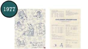
The brochure began with a handwritten and drawn, one-color cover.
Mismatching clip art was used to fill open space.
|
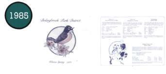
By 1 985 the cover moved to two-color.
Improved design work and clip art made the one-color inside more attractive.
|
|
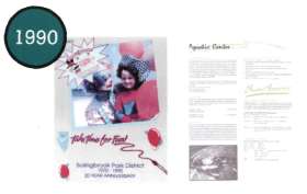
In 1990, the cover moved to four-color and better use of photography.
Programs were set off a little with the use of two-color on the inside of the brochure.
|
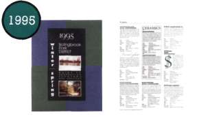
Creative cover designs became more of a focus in 1995, giving the brochure a more corporate feel.
Creative use of fonts added visual interest to the brochure.
|
|
|
|
|
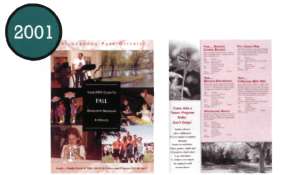
Photography was used in 2001 to show the park district's diversity in programming.
Moving to gloss inside and incorporating program benefits information stepped up the brochure.
|
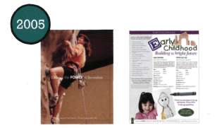
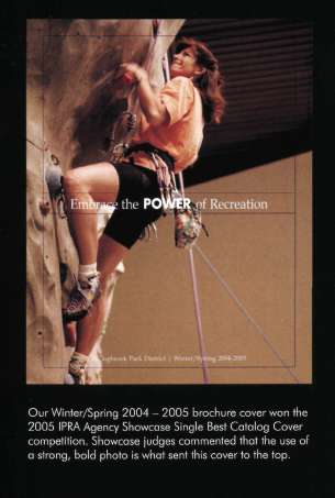
A simple statement and strong photo sends the perfect message to the residents of Bolingbrook Park District.
Moving to a four-color inside brought the photos and therefore the programs to life. All photos are actual park district participants.
|
July/August 2006 page 23
gorgeous and perfectly well built on the inside, but you didn't look because you assumed the inside was the same as the outside. That's exacdy how people will judge and react to your brochure. Try this experiment: show someone two flyers with the same content, except that one is professional and well laid out while the other is not. Most will choose the program from the professional looking flyer. Even though the content is the same, people perceive that the program listed in the professional looking flyer is better. That's why your high quality programming must be dressed up in a high quality brochure.
Going Four Color
Even if you have a tight budget, there are ways to upgrade the design of your brochure without increasing your overall costs. Print production has changed through the years. It is often no more expensive to print four-color than two-color.
Why is this? Most print jobs today are four-color, so it adds prepress time to thoroughly clean the press to accommodate your two-color project. This increases prepress costs. Take the time to get to know your printers. They are the experts. Ask them questions. Pick their brains to see what options are available to you within your budget. Most printers want to keep your business and will be happy to guide you.
It's a good idea to work with a couple different printers to keep them competitive. If your agency uses one printer for everything, you most likely are paying too much for some of your print jobs. Larger agencies are likely required to bid their seasonal brochures, but smaller ones should put theirs out for bid as well. This will help get a competitive price. If you know exactly what you want, then don't let the printers quote you the job based on variations to the bid specifications you put out. (The result will be many incomparable bids.) Determine what you want. Be rigid with your requirements, and you will be rewarded with a quality print job at a competitive price.
Getting Graphic
Upgrading your printing is not your only option for upgrading your brochure design. If you use clip art in your brochure, use the same style clip art throughout the brochure. This will dramatically impact the look of your design. You may also want to review your font usage. If the design task falls to you and you are not a professionally trained graphic artist, then stick to the rule of using no more than two fonts. You'll ensure a cleaner look.
Now that images come in digitized formats, adding photos is another fairly easy upgrade. This does not necessarily mean purchasing high quality stock photography. In fact, consider moving away from stock photography altogether. People like the
July/August 2006 page 24
Punching Up the ProseProgram descriptions are the meat of you seasonal brochure. As a marketing copywriter, you have two goals for each course description. First, it has to be accurate. For that, you rely on the course instructor. But that doesn't mean you simply accept what the instructor sends you. If you are unclear about an offering, you need to do a little investigative reporting. Contact the instructor and get all your questions answered before you do any rewriting.
The second goal is to sell that program. To do that, a strong description is vital.
You must connect with your readers and make them want to become program participants. Think about the program from the parents' or participants' perspective as you write. They want to know how this class will benefit them or their children. This does not necessarily mean simply listing a t-shirt is included. Parents are concerned with such issues as whether their youngsters will improve their gross motor skills. Adult participants want to know if they will be able to lose those love handles.
Give your readers — your potential clients — the real benefits of the class. That is what will entice them sign up.
Remember, good writing is rewriting. Here's an example of what revision can accomplish.
Program description from the instructor
Painting Pals
Use various paints to create beautiful art. Each project will tie in with a story, game, song or finger play. Please bring a smock to class. This class is for ages 3-5 years.
Program description as revised by the marketing copywriter
Painting Pals
A splash of fun will mesmerize preschoolers as they experiment with various paints and painting mediums. Children will improve their self-esteem by feeling the satisfaction of creating works of art all by themselves. Each week a delightful, expressive art project will tie in with a story, game, song or finger play. Roll up your sleeves, grab your smock and head for Painting Pals.
First, the copywriter put the age range information directly under the program title. This format allows individuals to scan long lists of program offerings to discover more quickly the programs that are appropriate for them. If the age information were hidden in the description, you'd run the risk of frustrating potential clients who might get excited by a class only to find out the ages do not fit their children.
Second, the copywriter added more action words to build excitement. The copywriter also found out — and specifically stated — the benefits children would gain by taking the class. In this example, a benefit is improving self-esteem, a benefit all parents want for their children.
Finally, a call to action has been added at the end of the description. Invite the readers to join the class.
July/August 2006 page 25
|
cont. from page 24 personal touch. They like to see their neighbors and friends participating in your programs. We are here to service our community and we should showcase our community. So, gather your own photos. If you are not great behind the digital camera, ask staff or customers who enjoy photography if they would be willing to help. It also never hurts to invest in a professional. To help improve the Bolingbrook Park District's seasonal brochure, we budgeted for a freelance photographer to come and get some key photos for the cover. Park district staff contributed all the other photos. Investing in one photo session got us photos for two years worth of covers. Another key aspect to photography is to make sure the photos fully represent your community and your programs and services. Bolingbrook Park District's covers feature more than children. We feature seniors, men, women and teens. We offer programs for people of all ages and abilities and our photos represent that. Keep that in mind when you are taking and choosing your photos. |
|
Doing the Distribution
Now that your content is great and you've made upgrades to your design without breaking the bank, you are done right? Not exactly. What good is a quality seasonal brochure if your residents never see it? You must get the brochure into you: residents' hands. This is a constant battle.
Some communities have tremendous success with door-to-door delivery methods, while others have success with mailing through the post office. The Bolingbrook Park District has used both methods over the last six years. Hiring a door-to-door delivery service worked great five or six years ago, but rapid growth in the community proved to be a challenge. The delivery company could not keep up with the new growth, and the number of households that didn't receive the brochure continued to rise. After discussing our challenges with a couple printers and working with the village, we moved to ink jetting specific addresses on our brochures and mailing them. Before each brochure mailing, the Village of Bolingbrook provides us with a list of all the addresses in Bolingbrook. (The village is keenly interested in accuracy for tax and utility billing purposes, so the list always includes the most recently built homes.) At the same time, we provide the printer with the list of nonresidents who participated in our programs over the last two years. The printer prepares the brochure for mailing, sorting and bar coding the pieces to receive the lowest possible postage rate. Delivery costs are higher than we paid with the door-to-door service, but through research and planning we were able to make design and printing upgrades without increasing those costs. Therefore, spending a little extra to ensure proper delivery is well worth it. We know our message is reaching our constituents.
Tying in to the Rest of the Marketing Plan
Does your seasonal brochure tie in to your Web site? All marketing and communications pieces should work in support of each other. This helps build your brand with your residents. This reaches far beyond your logo. Do you use similar photos? Is the writing style similar? Does your Web site and seasonal brochure send the message you are looking to convey about yourself? This is how you build your brand.
Bolingbrook Park District has experienced continued growth in online registration. However, the demand for our brochure has not dwindled. People enjoy paging through the seasonal brochure. They make notes in the brochure, put it down and come back to it later. They may ultimately register online, but their planning is still primarily through the printed guide. That practice may change in the future as clients get used to the Internet, but for now it is simply not feasible to rely only on your Web site or a CD-Rom.
Rising Like a Phoenix
Upgrading the Bolingbrook Park District's seasonal brochure has turned it into a rising phoenix. It helped take our other marketing and communication efforts to new levels. In another three to four years, the brochure will likely reinvent itself to meet the needs of the community. Maybe it will move to a CD mailed to the homes. Maybe it will never leave print. But, in whatever form it takes, the seasonal brochure will always be a major part of any park and recreation agency's marketing and communications effort. Re-embrace the seasonal brochure and let it take you to new levels.
Kimberly Smith is the marketing and communications manager for the Bolingbrook Park District, which has won the NRPA Kudos Awards Program Best Overall Communicator 1 999 through 2005 and Best Web Site 2003. Bolingbrook Park District also was awarded the 2005 IPRA Agency Showcase Single Catalog Cover, Division C.
July/August 2006 page 26
How Do Your Marketing Efforts Stack Up? Find Out with the IPRA Agency Showcase Competition
The Agency Showcase Competition is the premier communication and marketing competition for park, recreation and conservation agencies in Illinois. Each year, professionals in the printing and advertising fields judge hundreds of creative pieces designed by IPRA members. There are several categories for you to submit your creative work, including:
• Single Catalog Cover
• Catalog Cover Series
• Single Catalog Content
• Annual Report Content
• Specific Facility Brochure/Specific Program/Event Brochure
• Logo Design
• Web Site
• Printed Newsletter
• Electronic Newsletter
Submit your best communication and marketing work used during the 2006 calendar year. Winners of each category will be recognized at the Friday Award's Luncheon at the Conference, as well as online at www.ILipra.org. Categories are divided into different sections based on the equalized assessed value of your agency so that every agency, large or small, has a chance at winning.
The Agency Showcase Competition entry forms will be available online for download at www.ILipra.org beginning September 1 and all entries must be received by December 1. To be eligible, an agency must be a member of IAPD or have a member of IPRA on staff.
For more information about the Agency Showcase Competition, please contact IPRA Marketing & Communications Director Matt White at (630) 376-1911 or matt@ILipra.org. You can also see last year's winners online at http://www.ILipra.org/Members/agencyshowcase.cfm.
www.ILparks.org July/August 2006 27
|